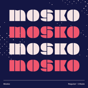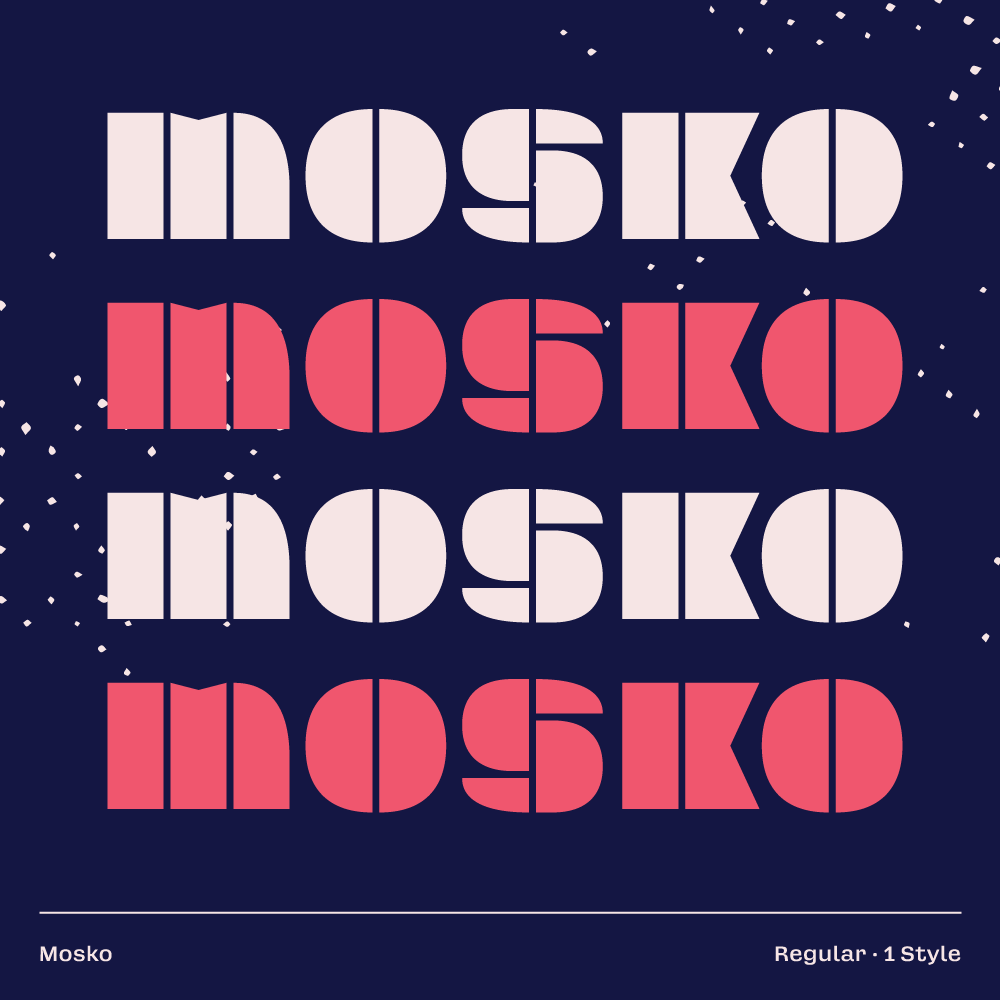
Description
Mosko was inspired by a hotel logo from Berlin, operating during the time of Soviet occupation. The original logotype only contained four letters to extract potential letterform DNA from; regardless, the sample was an adequate starting point and helped motivate initial designs for the alphabet. The name Mosko is an anagram of the hotel’s original moniker KOSMOS, alluding to the history it stands on.
The fall of the Berlin Wall took place amid a wave of revolutions across Soviet territories, denoting the start of the collapse of the Soviet Union and the end of the Cold War. This highly political era inspired Mosko’s bold assertive appearance. The entire typeface is divided down the centre, just like the Berlin Wall divided an entire city into segregated areas. Its glyphs are constructed using shared pieces. This isn’t dictated by a formula but rather by necessity (similar to a group of revolutionaries openly sharing resources amongst each other).
The lack of lowercase is an intended choice since Mosko is not meant to be used quietly. It demands to be screamed into the world—adorned on a cardboard protest sign or painted across a wall.