Description
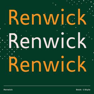
Renwick is a humanist sans serif inspired by the great British typefaces of the 1920s, such as Johnston Sans, Gill Sans, and Granby. Unfortunately, these fonts weren’t designed for body copy and feel cramped when used in large paragraphs. Renwick on the other hand was developed specifically for typesetting books at a 9pt size. Nuanced optimizations such as ample spacing, taller x-height, and open apertures ensure it’s ideal for extensive use.
Renwick’s name comes from a tiny village located in England’s northern countryside (populated by everyday people, and allegedly terrorized by a cockatrice in 1733). The town name itself descends from the Old English term for farmstead and settlement. The beautifully mundane attributes found in Renwick’s glyphs mimic working-class traits—a humble, straightforward, and helpful attitude.
Construction & Process
Renwick also includes subtle nods to traditional English architecture—such as the leg of the R modelled after a cathedral archway. The uppercase follows the classic Roman proportions found on the Trajan Column; these varying widths feel vibrant and give the text a sense of bravado. The lowercase is more comparable to calligraphy, ensuring that readability is elevated. Renwick also includes a full set of proper small caps, accessible through OpenType features.