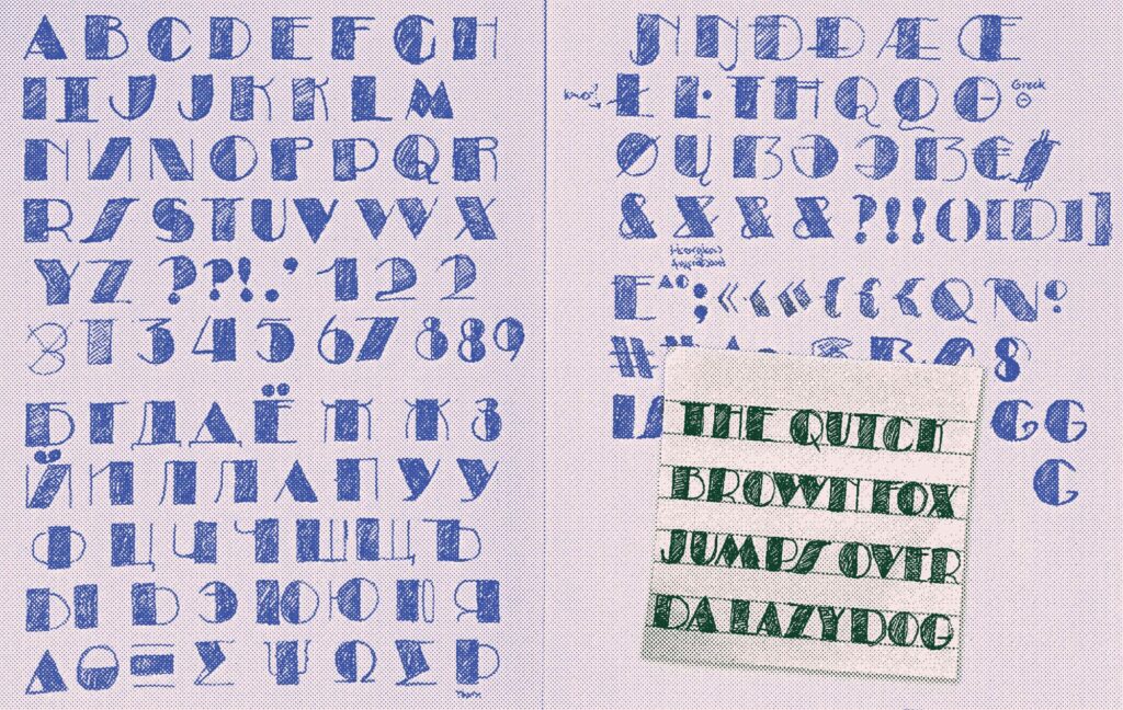
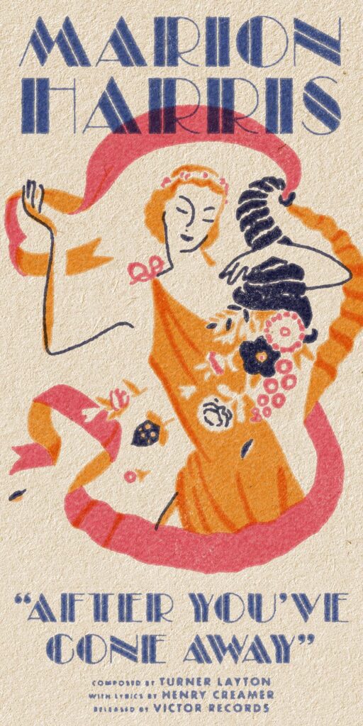
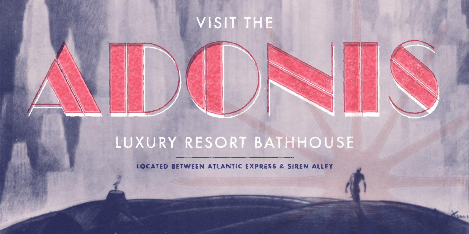
Design features: All caps Exaggerated counters Geometric construction Extreme contrast
OpenType features: Localized forms Contextual kerning Proportional lining figures
Stylistic sets: ss01 · Angled S ss02 · Serifed I ss03 · Nested umlaut Ö Ä Ü ss04 · Bulgarian forms ss05 · Toothless Д ss06 · Stacked Ы ss07 · Thick stem Њ ss08 · Flat-sided Ћ Ђ ss09 · Cap height ( ) [ ] { } ss10 · Cap height ¡ ¿ ss11 · Thin « » ss12 · Hollow zero ss13 · Large ® symbol ss14 · Tofu logo ss15 · Chinese Tofu logo
Credits: Reese Lee · type design and production
The story of Meiros
After spending too much time working on Renwick (a low contrast humanist typeface) the urge to create something completely opposite never stopped growing. This idea birthed Meiros, a super high contrast geometric typeface, and finally quenched my thirst for a stylistic 180°.
Because I pushed the contrast as far as possible, the dark areas felt too heavy compared to the light hairlines. To alleviate this imbalance, I introduced a “cut” through each heavy section. This inadvertently gave the design some sexy directional rhythm!
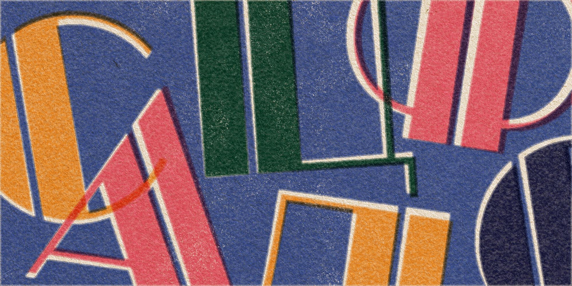
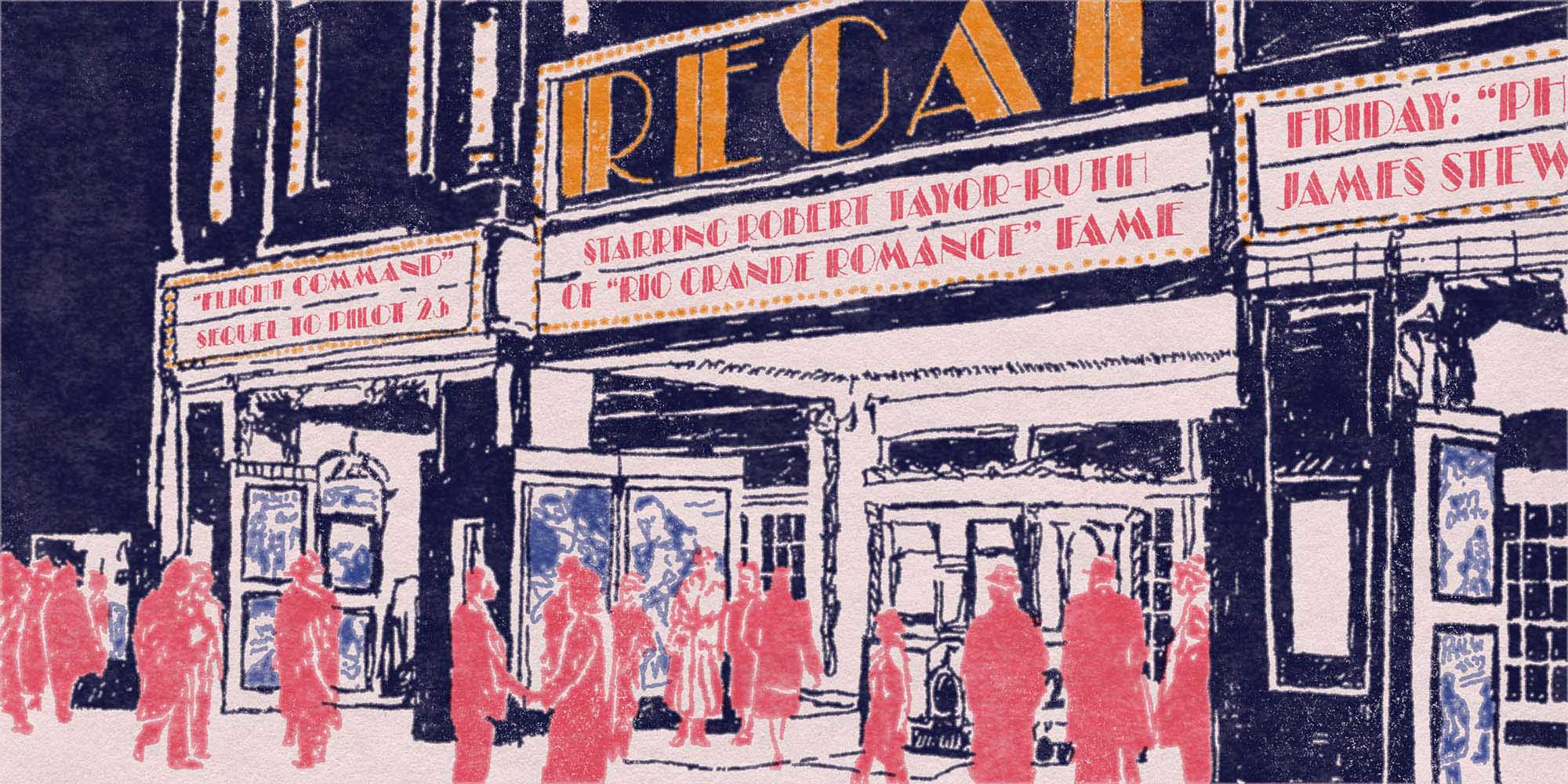
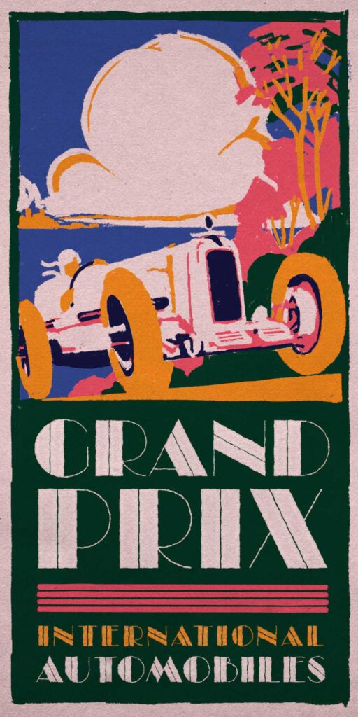
Meiros is inspired by the Art Deco movement and the geometric creativity that many artists of the time proudly revelled in. BioShock, specifically, was a huge inspiration and remains one of my favourite stories of all time. Now, would you kindly try Meiros?