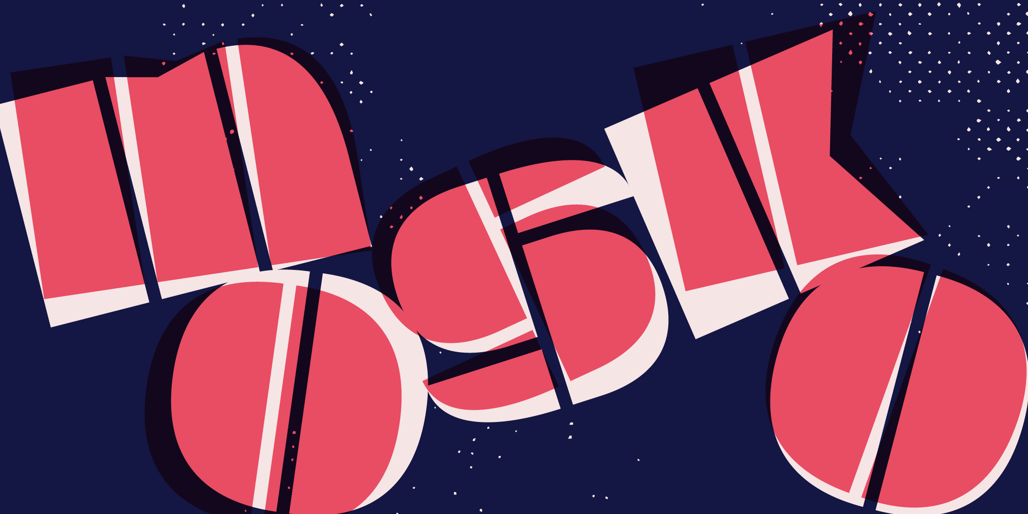
Mosko
All caps. No brakes.
Quick facts
Initial release: May 2023
Current version: 1.014
Total styles: 1
Script: Latin
Class: Sans, stencil, display, German
Design features:
Modern proportions
Vertical rhythm
Capital letterforms only
Dark colour
OpenType features:
Localized forms
Smart fractions
Stylistic sets:
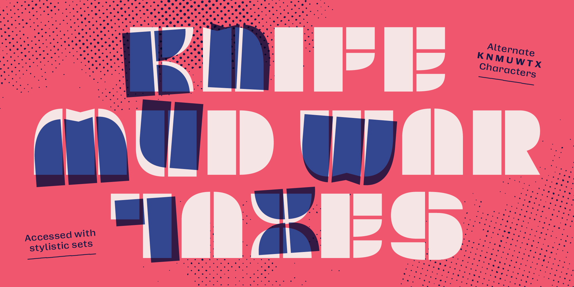
ss01 · Round M W
ss02 · Round K X
ss03 · Asymmetrical U
ss04 · Lowercase N
ss05 · Lining ¿ ¡
Credits:
Reese Lee · type design and production
The story of Mosko
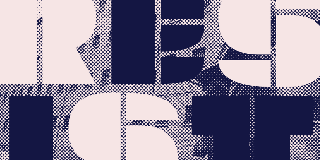
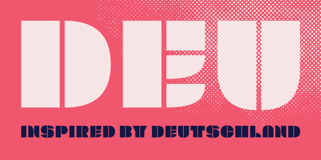
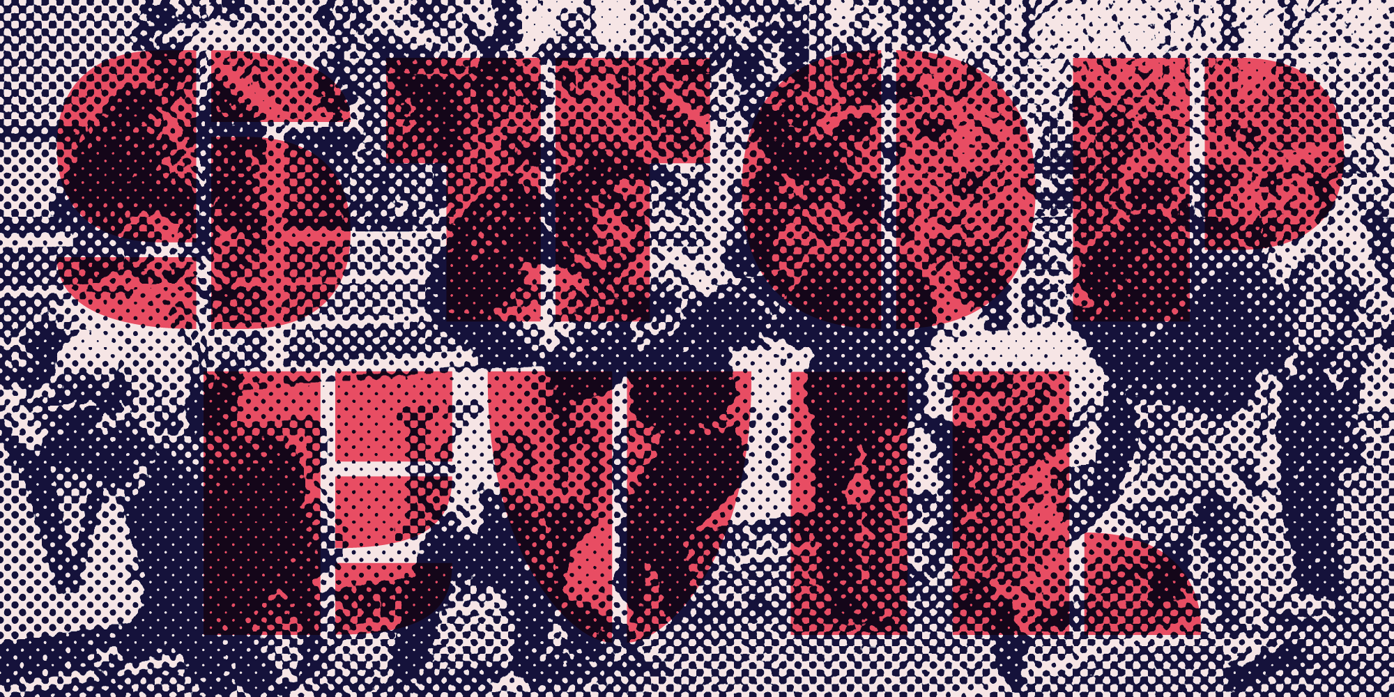
Mosko is inspired by the political division of separated East/West Berlin during the Cold War. It’s designed for large display use, features chunky stencil-like construction, and has a heavy presence. Use Mosko. Be heard.
The design is inspired by a restaurant logo from Berlin, which operated during the era of Soviet occupation. The name “Mosko” is an anagram of the restaurant’s original moniker “KOSMOS”, alluding to the history it stands on.
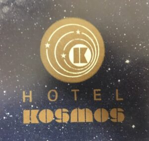
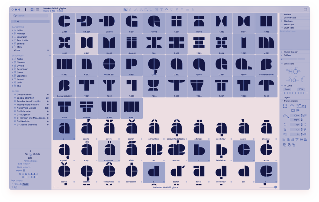
The fall of the Berlin Wall took place amid a wave of revolutions across Soviet territories, denoting the start of the collapse of the Soviet Union and the end of the Cold War. This highly political era inspired Mosko’s bold assertive appearance. The entire typeface is divided down the centre, just like the Berlin Wall divided an entire city into segregated areas. Its glyphs are constructed using shared pieces. This isn’t dictated by a formula but rather by necessity (similar to a group of revolutionaries openly sharing resources amongst each other).
The lack of lowercase is an intended choice since Mosko is not meant to be used quietly. It demands to be screamed into the world—adorned on a cardboard sign or painted across a wall.
Regular
Regular
Regular
Regular
Font Size
Line Height
Letter Spacing
Round M W (ss01)
Lowercase N (ss04)
Smart fractions
Round K X (ss02)
Lining ¿ ¡ (ss05)
Localized forms
Asymmetrical U (ss03)
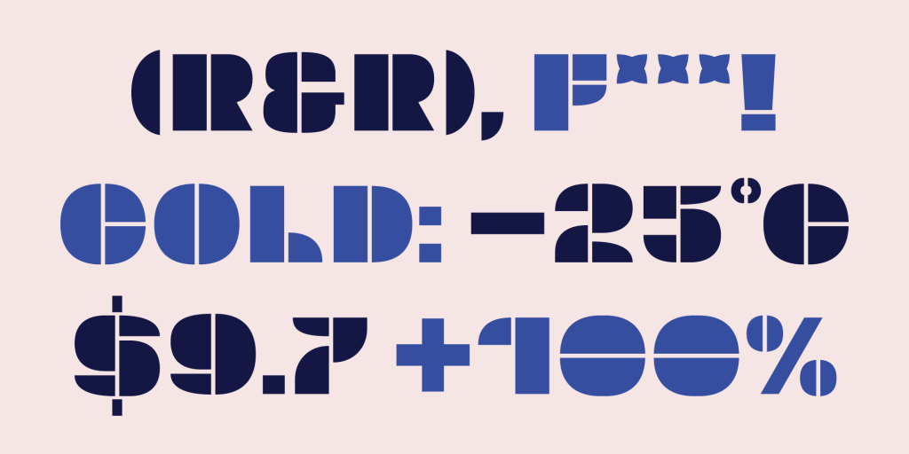
Slashed zero
Th–tha–th–that’s all folks!