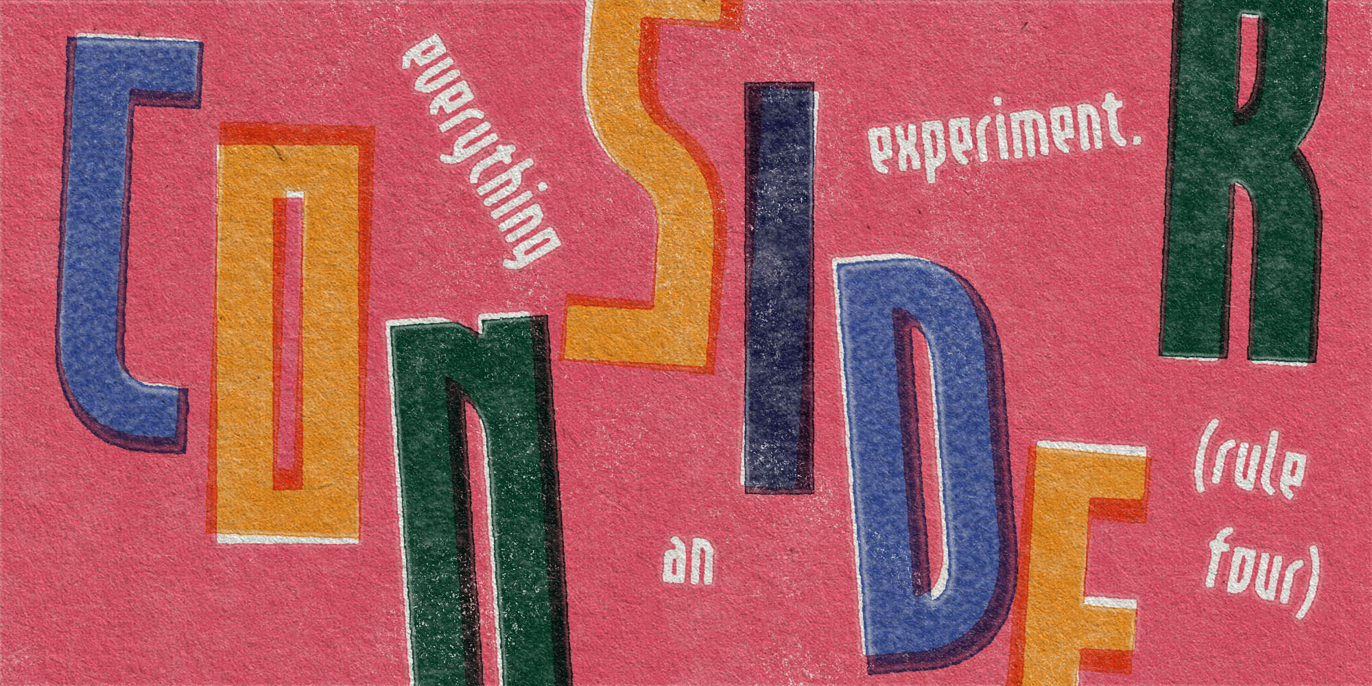
Demur
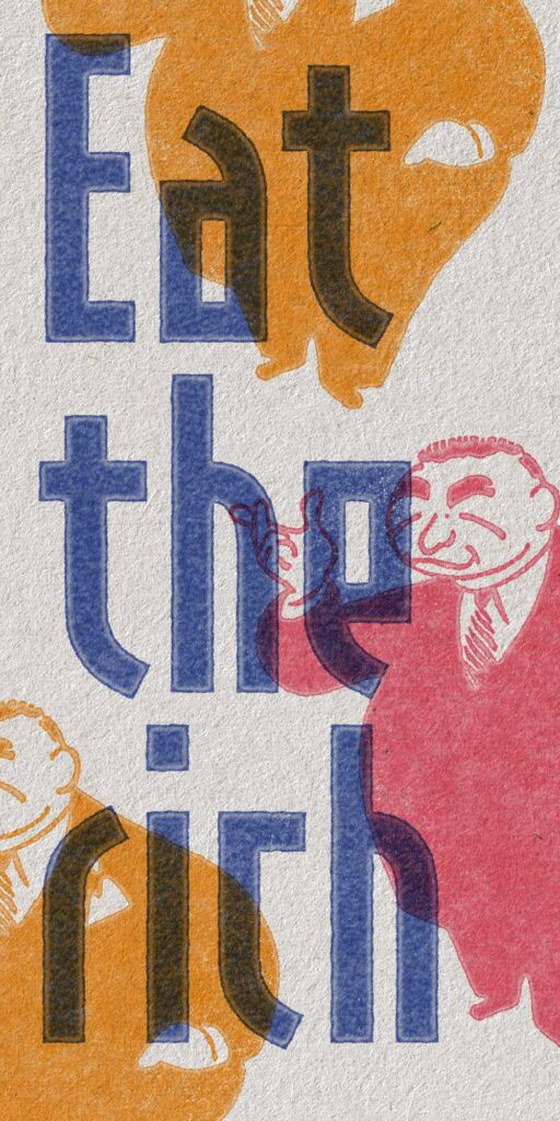
This font kills fascists.
Quick facts
Initial release: August 2024
Current version: 1.000
Total styles: 1
Script: Latin, Cyrillic
Class: Sans, constructivist
Design features:
Tall x-height
Condensed proportions
Modular construction
Tight spacing
OpenType features:
Localized forms
Contextual alternates
Superscript figures
Subscript figures
Scientific superiors
Scientific inferiors
Smart fractions
Lining figures
Oldstyle figures
Proportional figures
Tabular figures
Stylistic sets:
ss01 · Bulgarian forms
ss02 · Serbian forms
ss03 · Straight 1
ss04 · 1919 logo
ss05 · Tofu logo
Credits:
Reese Lee · type design and production
Darren Stebeleski · 1919 logo design
The story of Demur
Noun; the action or process of objecting to something.
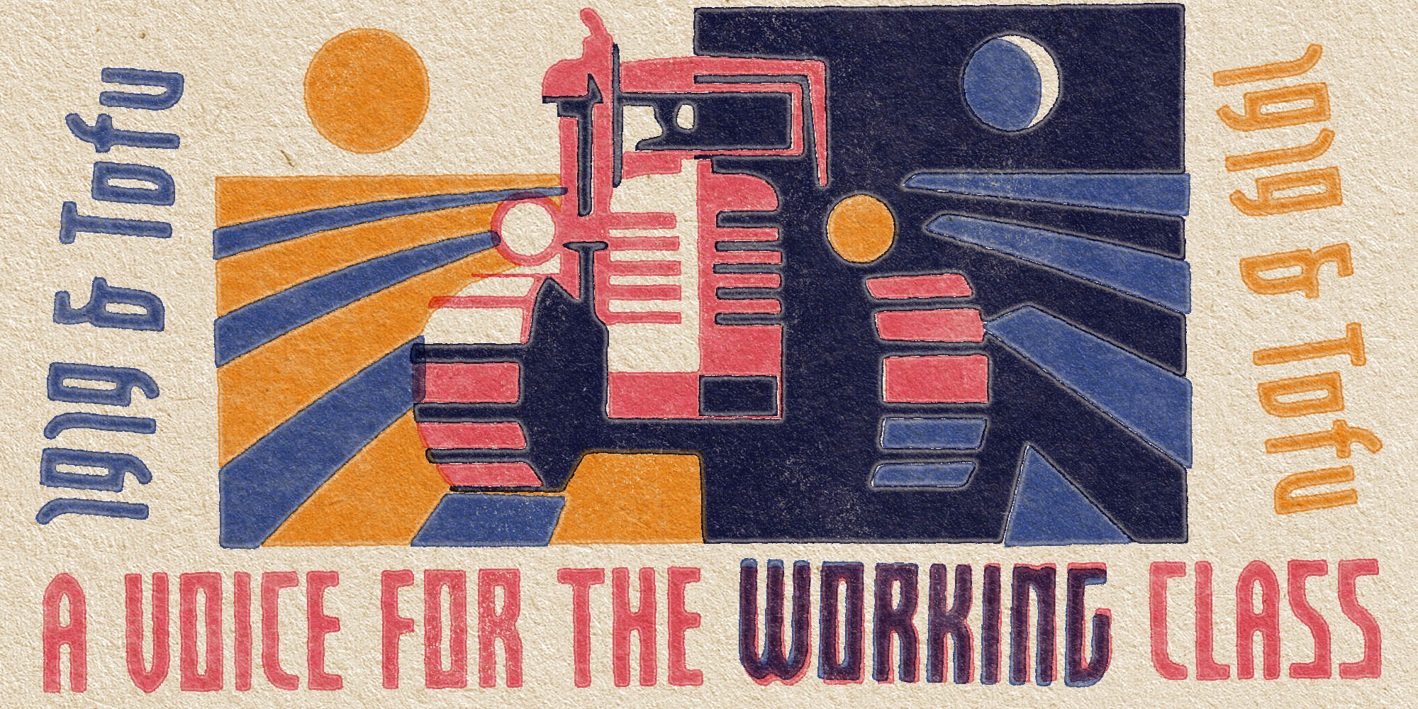
Demur is a sans inspired by social issues and constructivist aesthetics. It was commissioned by the Winnipeg 1919 Workers Collective and expanded its existing logo into a full font.
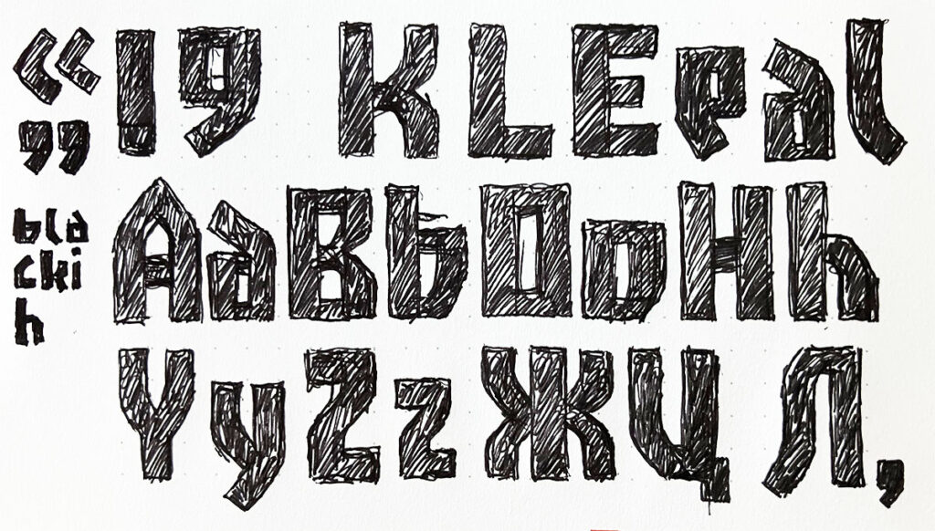
Demur’s condensed proportions and tight spacing pack letters together like a crowd of marching protesters. The modular construction gives the typeface rhythm and commonality, ensuring the glyphs are cut from the same cloth. This is not your typical boring sans serif.
Despite having a generous x-height, this font is best used at medium to large sizes when emphasis is required—like the headlines on a grassroots zine publication. While you can use it however you want, I ask that you avoid using it in anything harmful or hateful towards others.
Regular
Regular
Regular
Regular
Font Size
Line Height
Letter Spacing
Bulgarian forms (ss01)
1919 logo (ss04)
Smart fractions
Standard ligatures
Serbian forms (ss02)
Tofu logo (ss05)
Oldstyle figures
Discretionary ligatures
Straight 1 (ss03)
Ukrainian localization
Tabular figures
Localized for German, Romanian, Moldovan, Dutch, and more

Th–tha–th–that’s all folks!